Responsive Web Design
Desktops, tablets, and phones are just a few of the many devices that may be used to access web sites. No matter the device, your website should be appealing to the eye and simple to navigate.
When you use CSS and HTML to resize, hide, shrink, enlarge, or relocate the content so that it looks nice on any screen, you are using responsive web design.
Viewports
A viewport represents the area in webpage visible to the user. In web browser terms, it is generally the same as the browser window, not including menu bar and the browser UI.
- On larger monitors where applications aren't necessarily full screen, the viewport is the size of the browser window.
- On most mobile devices and when the browser is in fullscreen mode, the viewport is the entire screen.
- In fullscreen mode, the viewport is the device screen, the window is the browser window, which can be as big as the viewport or smaller, and the document is the website, which can be much taller or wider than the viewport.
To set the viewport, include the following code to your HTML head:
<meta name="viewport" content="width=device-width,
                initial-scale=1.0" />
Media Queries
Media query is a CSS technique introduced in CSS3. It uses the @media rule to include a block of CSS properties only if a certain condition is true.
Media queries are useful when you want to modify your site depending on a device's general type (such as print vs. screen) or specific characteristics and parameters (such as screen resolution or browser viewport width).
                  @media only screen and (max-width: 768px) {

                    #someDiv {

                      display: none;

                    }

                  }
The above code will change the element with id of "someDiv"'s display property to none if the screen size is 600px wide or less, thus hiding the div
Responsive Images
Images are important part of any web pages. They can improve the design and the appearance of a web page. To make them responsive and look good in any viewport, simply add the following CSS:
                  img {

                  width: 100%;

                  height: auto;

                  }
The above code will make the images fit the containers width and its height will adjust proportionally
Exercise
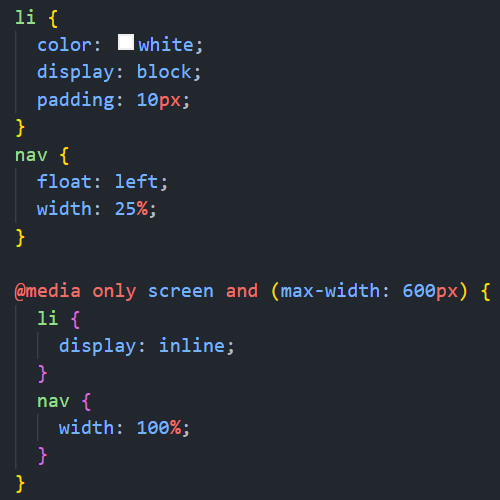
Using What you have learned so far, try changing the orientation and position of the navigation when the screen size is less than 600px
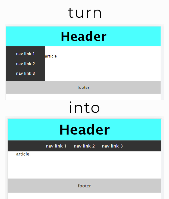 Show Answer